
Have you ever wondered why some videos get tons of views while others seem to go unnoticed? One major reason is the thumbnail. A great thumbnail catches the eye, sparks curiosity, and convinces someone to click.
In this blog post, you’ll learn how to create professional-quality thumbnails using design tools, even if you’re just getting started. By the end, you’ll have the confidence and skills to make thumbnails that attract viewers and boost engagement.
Why Thumbnails Matter More Than You Think
Before diving into the tools, it’s important to understand why thumbnails matter so much. Thumbnails are the first thing people see when they browse content, and they work like book covers. If the cover doesn’t catch the eye, people may skip past without ever clicking to see more.
Thumbnails also play a big role in building your brand. When your design style stays the same across your content, people begin to recognize your work. This helps build trust, and when viewers trust your content, they’re more likely to click, watch, and come back again.
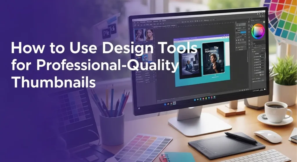
Choosing the Right Design Tool Is Key
Choosing a design tool is simple, even for beginners. Many easy-to-use options are available online or as downloads. The best ones let you create clean, eye-catching designs without learning complex software.
Some tools offer ready-made templates to guide your layout. You can easily drag in images, change colors, and add text. Features like layers and text effects help you adjust the details with ease.
If you’re just starting, don’t worry about learning professional software right away. There’s no need to feel stuck without a free thumbnail maker because many tools already have everything you need to get started. The goal is to create something clean, bold, and easy to read at a glance.
Design Elements That Make Thumbnails Pop
To create a strong thumbnail, you need to understand a few key design elements. These include color, font, layout, and images. Each of these parts works together to tell the viewer what your content is about.
Color is one of the first things people notice. Bright colors stand out, especially when they contrast with the background. Pick two or three colors that work well together and stick to them.
This will help your thumbnails look balanced and clear. Font choice is just as important. Use bold, simple fonts that are easy to read. Avoid using more than two types of fonts in one design.
If your text is too small or hard to read, people may scroll past without a second thought. The layout of your thumbnail should be clean and not too crowded. Leave space around the edges. Use large images and bold text.
Make sure the viewer’s eyes go to the most important parts right away. Images bring everything together. Choose pictures that are clear and not blurry.
High-quality photos or graphics help your thumbnail look more polished. Whether it’s a photo of your face, a product, or a scene, make sure it fits the message you’re trying to share.
How to Plan Your Thumbnail Before You Design
Jumping into design without a plan can lead to mixed results. Planning your thumbnail helps you work faster and smarter. Start by thinking about your message.
What do you want the viewer to feel or understand? Write down a few words that match the mood or theme of your content. Think about your audience, too.
Are they students, gamers, teachers, or hobbyists? Knowing who you’re trying to reach helps you choose better images and text. For example, a fun gaming video might need bright colors and playful fonts, while a how-to tutorial could use clean lines and calm tones.
Next, sketch a few ideas on paper or in your design tool. This doesn’t need to be perfect. Even a quick drawing can help you picture the final layout.
Decide where the text will go, what image you’ll use, and how it all fits together. This small step saves time and helps you avoid redoing your work over and over. Planning helps keep your message clear, your design balanced, and your style on track.
Tips to Make Your Thumbnails Look Professional
Even simple tools can produce amazing results if you use them well. Start by making sure your image size is right. A common size for thumbnails is 1280×720 pixels.
This keeps your image sharp and avoids stretching or blur when uploaded. Use the same style across your thumbnails. This includes the same color themes, font types, and logo if you have one.
This makes your content feel more organized and shows viewers that you take your work seriously. Add shadows or outlines to your text to make it stand out. This helps when the background is busy or colorful.
Play with contrast-light text on a dark background or dark text on a light background. Keep your thumbnails clear and focused. Avoid adding too much text or too many images. The best thumbnails often have just one picture and one short phrase.
Finally, take a moment to step back and look at your design before saving it. Ask yourself: Is it eye-catching, would I click on it? If the answer is yes, then you’re on the right path.
Practice Makes Better Results
You won’t make perfect thumbnails right away, and that’s okay. Like any skill, designing takes practice. The more you try, the better you’ll get at choosing the right colors, fonts, and images.
Try creating different versions of the same thumbnail. See which ones get more clicks or likes. Over time, patterns will start to appear.
You’ll learn what works and what doesn’t for your audience. Look at what others are doing, too. Search for content like yours and study the thumbnails that stand out.
You can learn a lot by watching how others use design tools to grab attention. Don’t be afraid to experiment.
Use different tools, try new layouts, and keep learning. Every thumbnail you create is a step toward mastering your style.
Unlock the Power of Great Thumbnails
Creating professional-quality thumbnails doesn’t have to be hard or expensive. With the right tools and a bit of practice, you can design eye-catching visuals that tell your story and pull in your audience. Whether you’re new to content creation or just looking to improve your skills, these tips can help you stand out in a crowded digital world.
Did this guide help you? Browse the rest of this section for more advice on a variety of topics.